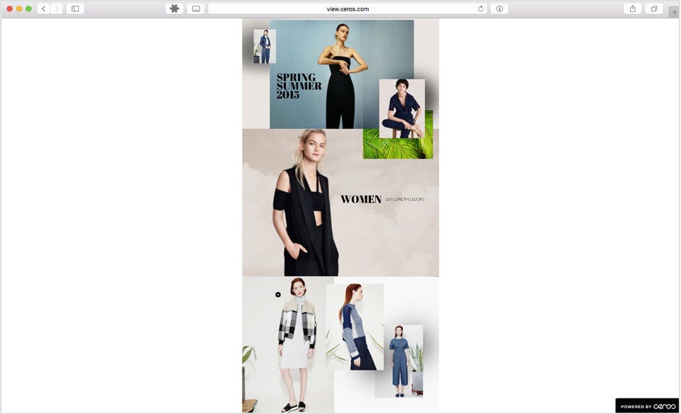
Scrolling pages can be useful for interactive infographics, landing pages, and other long-form content. Fortunately, Studio makes it easy for you to design long scrolling experiences.
Setting Page Width, Height, and Browser Scaling

If you click on ‘Canvas’ at the top of your experience's Layers Panel, you’ll have access to the Canvas Settings in the Design tab.
Width defines how wide you want the canvas to be.
Height sets the total height of the entire canvas.
Browser Scaling determines how your experience will scale when opened full screen.
Scale to Fold, you’ll have the option to set a height that will determine how much of the page will show before scrolling.
Full Width will ensure the experience is expanded to the edges of the browser and will fill up the entire window.
No Scaling will not have your experience scale to the browser at all.
If you choose to Scale to Fold, you can create a scrolling page by setting a Page Height taller than the fold. Setting a Page Height that is smaller than the Fold height will automatically snap the Page Height to the fold height.
Each page can be up to 100,000 pixels tall. When adding new pages, the Page Height will automatically snap to the height of the last page you worked on.
Note: Pages exceeding 30,000 pixels in height may cause loading issues for the user depending on the amount of content (and the size of those assets) within the experience.
If your page scrolls, a fold line will appear on the canvas. Everything above that line will appear in the browser window on page load. Everything below it will appear as you scroll down the page.
Any animations below the fold line will play when the visitor scrolls to that part of the page.
When creating different device variants, your width will automatically snap to 1280 pixels for desktop, 540 pixels for mobile, and 768 pixels for tablet. These are the widths we typically design for each device, but you can go in and edit these however you need for each experience.
Comparing Fold Height and Page Height
Experiences scale to fit everything above the fold line into whatever space it's displayed in. That means content with a large fold height will shrink down in your browser window.
For example, take a look at this experience set to a 1024-pixel width and 2048-pixel fold line:

The reason this experience displays more narrowly than the specified 1024px width is that the experience is set to display everything above the fold line.


